
Rediscovering the Art of Swiss Chocolate
Carrack Chocolates entered the highly competitive and exclusive Swiss chocolate market with a unique story and a truly innovative approach.

Emile, a businessman with a travel agency, a background in finance, and a driving passion for mastery in all his pursuits, embarked on a journey to understand, perfect, and ultimately innovate Swiss chocolate-making. His obsessive curiosity led him to build his own husking machine and invest deeply in a factory, all driven by a desire to push the boundaries of traditional chocolate craftsmanship.
The challenge was clear: how to position this new venture in a market steeped in tradition and renowned for its high standards, while also showcasing the personal and pioneering spirit behind it.
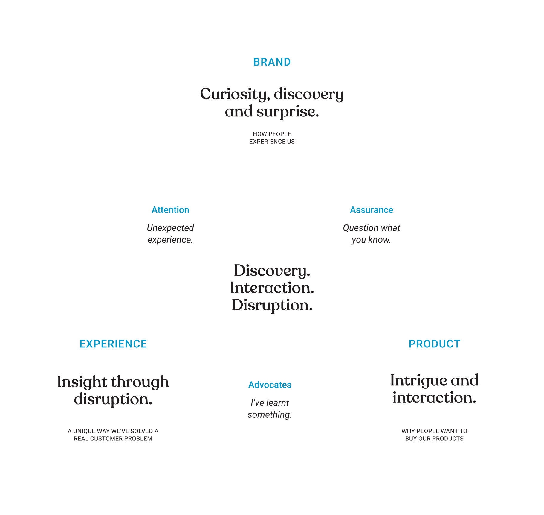
We addressed this challenge by crafting a brand strategy that leveraged the owner's personal journey of exploration and mastery. The strategy positions Carrack Chocolates not just as a producer of fine confections but as an invitation to "rediscover what you know about chocolate." This resonates with a detailed customer profile eager to learn and explore alongside the chocolatier.
The core message shifts from a declaration of quality to an engaging invitation.
The brand puts emphasis on sincerity in traditional Swiss processes, curiosity about the potential of perfected recipes, and a disruptive spirit in uncovering new possibilities with taste experimentation.
This strategy is the bedrock for the product line, which launched with six minimalist "Grand Crus" chocolates, each made with only three ingredients but with vastly different, surprising flavours.

Following the brand strategy development, we sought to develop packaging that would visually translate and clearly interpret these core concepts.
A pre-determined budget allowed me to work with graphic designers who were the right fit for the brand’s unique essence: tradition, curiosity & disruption.
The resulting design is a strategic choice to attract customers by disrupting what they might expect from traditional Swiss products, inviting them to “join us” on a journey of discovery rather than simply telling them about the product's quality.

The packaging design becomes the perfect vehicle to communicate Carrack's values.
The base template reflects a vintage travel ticket, with aged pastel colours and letterpress style typography. This design is a nod to both the brand's name, a carrack being a sailing ship, and the founder's passion for travel. It metaphorically serves as a "ticket to join us" on a journey of discovery to exotic places like South America and North Africa, where the cocoa is sourced.
This simple, honest exterior, with its minimal ingredient lists, is strategically chosen to build trust through transparency, and create a sharp contrast to the bright surprise waiting inside.

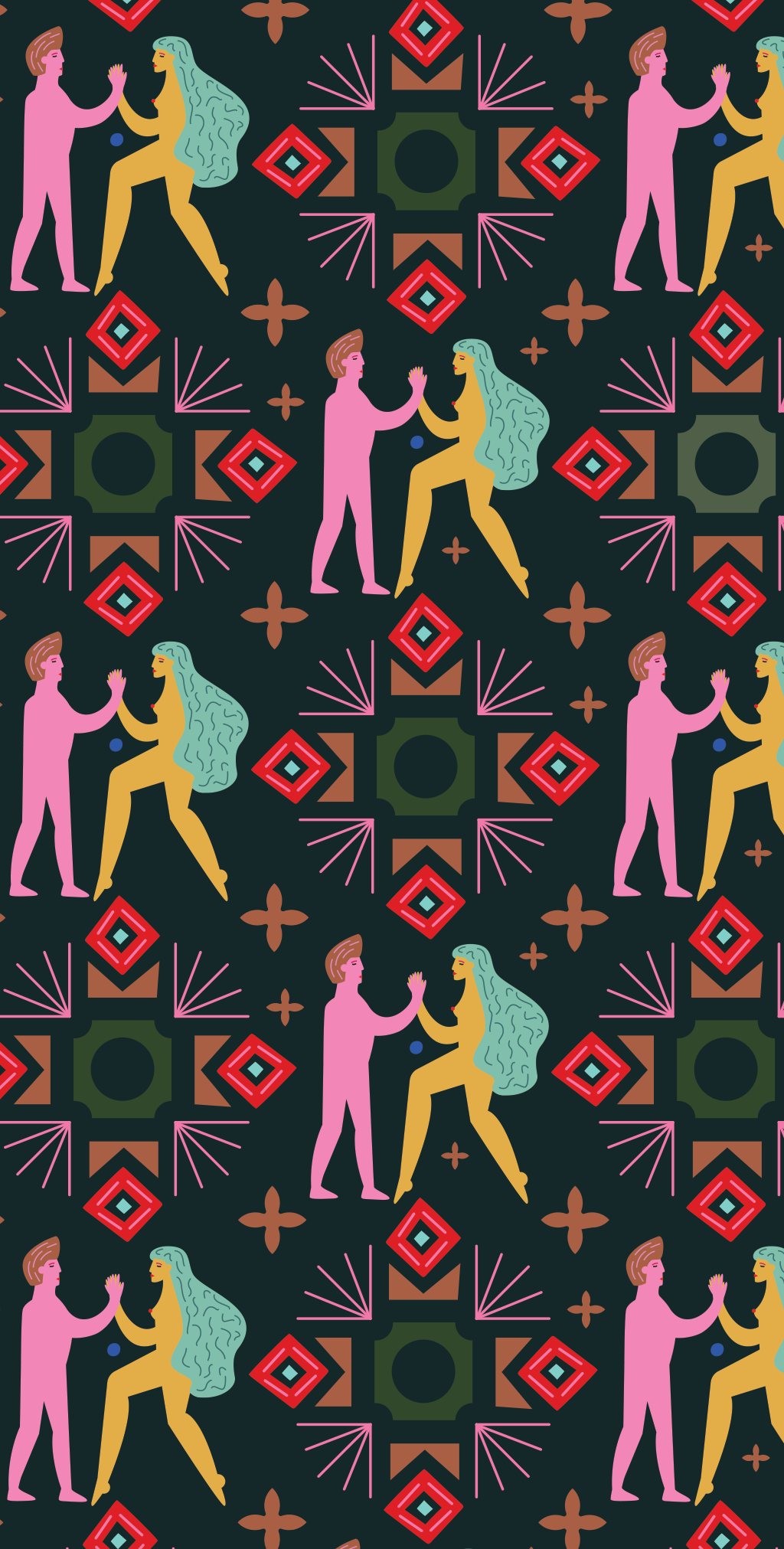
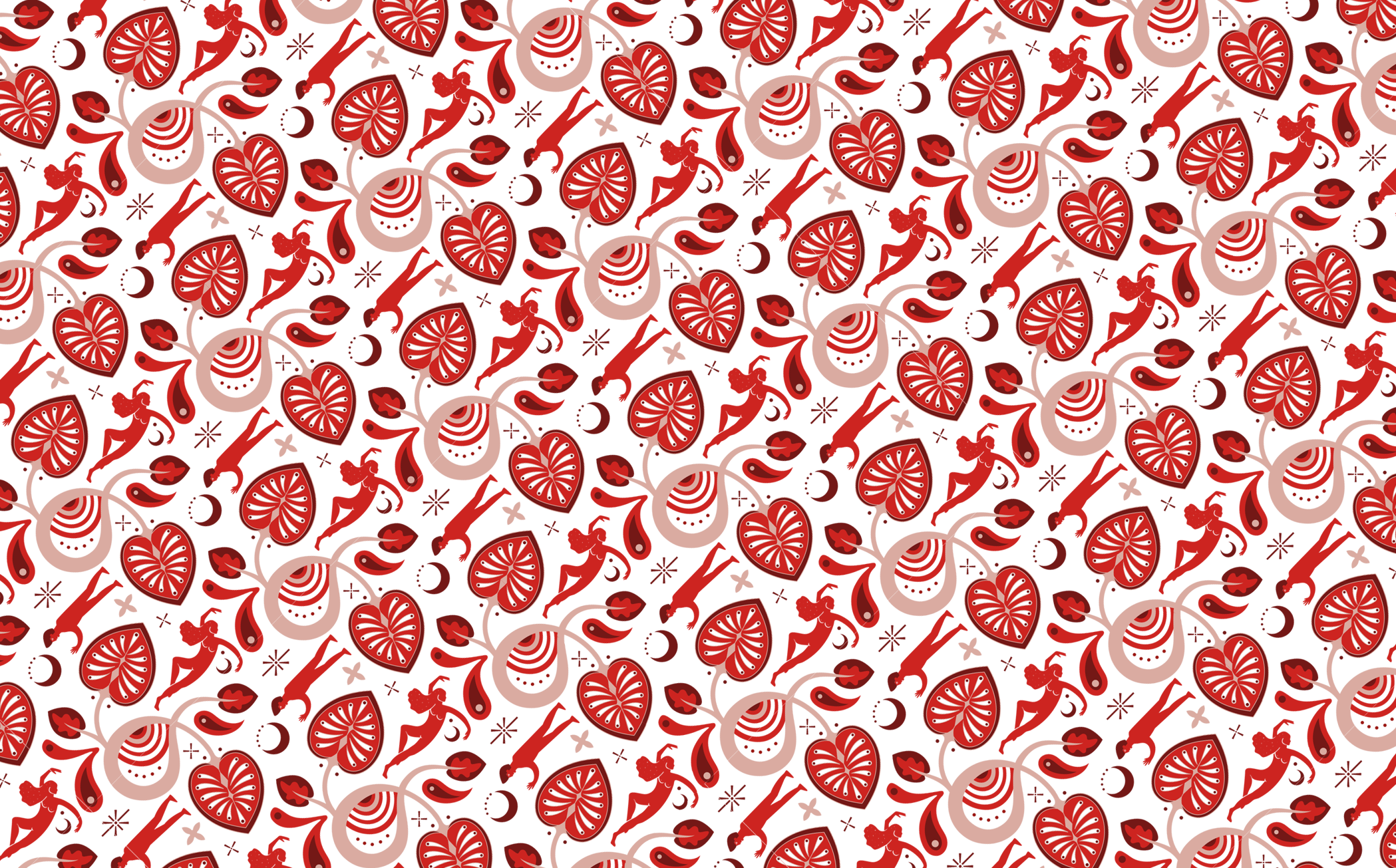
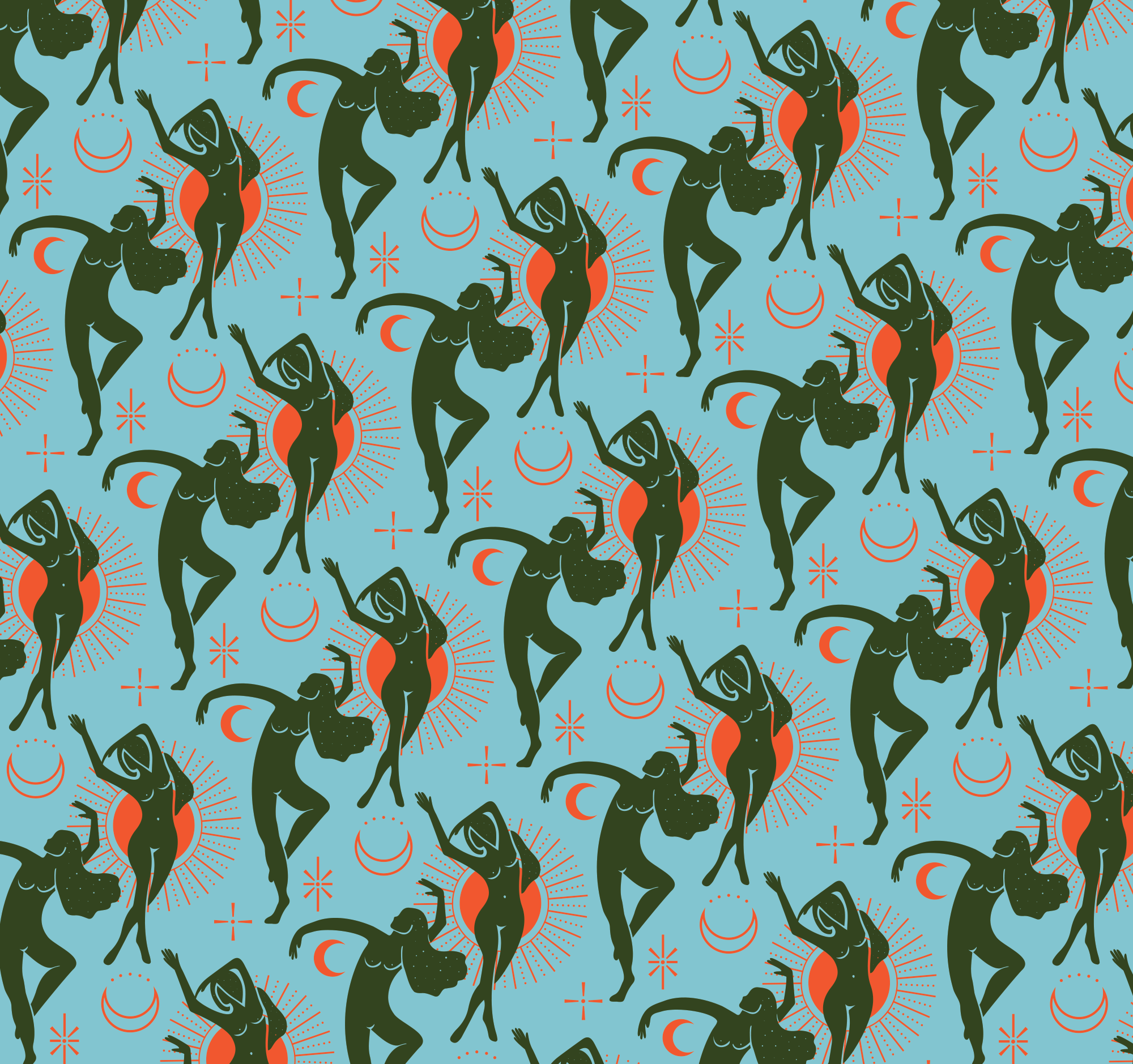
The element of surprise was delivered by a talented illustrator who developed six distinct patterns for the inside of the packaging.
Each pattern reflects not just the flavour profile of the chocolate but also the distinct culture of the cocoa's source country. These vibrant, intricate designs contrast strikingly with the simple exterior, giving the brand a distinct, surprising edge within a competitive landscape.
This unexpected reveal directly supports the brand strategy of rediscovery, demonstrating that while the craftsmanship is strictly Swiss, the possibilities are boundless.


Ultimately, this approach helped Carrack Chocolates launch with a splash of colour and flavour into the strict, clean world of Swiss chocolate, establishing a brand identity that continues to experiment and play.

Key people involved:
Emile Germiquet ~ Co-founder, Carrack Chocolate
Alain Chanson ~ Co-founder, Carrack Chocolate
Rohan Etsebeth ~ Graphic design
Alwine Nolte ~ Graphic design
Esti le Roux ~ Patterns
Livio Tronchin ~ Copywriting
To respect the confidential nature of my strategic work, my website offers a general overview of my process and project outcomes; detailed information is available upon request.
